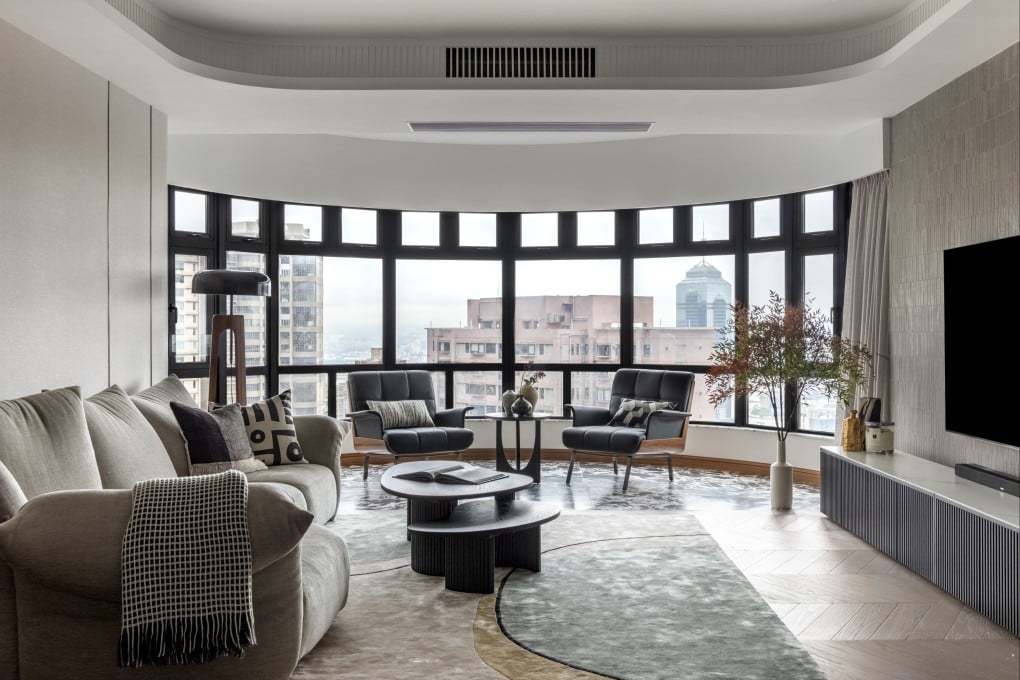
Mid-century modern meets retro style in a Hong Kong home that marries masculine minimalism with colourful quirkiness
- A couple waited two decades for the chance to buy an apartment in their favoured complex, then faced the challenge of accommodating their opposing tastes
- A designer bridged the gap between his desire for a minimalist look and her liking for colour via a neutral palette spiced with art, textures and patterns

The saying about good things coming to those who wait could have been coined with Cindy and David Lee in mind.
In 2003, after trying without success to buy a flat in a Mid-Levels development they particularly liked, the Hong Kong couple (who have two sons, aged 11 and 14), decided to keep renting until something comparable came up.
Fast forward almost two decades and the Lees, who still had not stepped onto the housing ladder, heard that a 2,600 sq ft (240 square metre) unit in that same complex was for sale.
“The building is my husband’s favourite because of its facilities, convenient location and spectacular urban views,” says Cindy of the residential block they moved into a year ago. “Although we kept looking, we never found anything we liked as much.
YC came up with a style that was neither mine nor David’s but yet has elements of both
“Many of the apartments had originally been sold to friends and family of the owner and almost never came onto the market – especially units on higher floors such as this one.
“It was a rare opportunity.”